Components
Getting Started
To get started, you just have to copy this in link html tag in header.
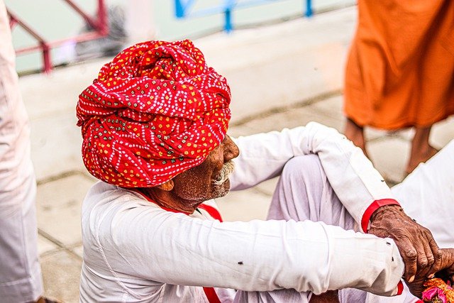
Avataars
Avatar can be used to show user's profile picture on profile information page, on navigation bar, in blogs grid items.
Example of Image Avataar
Avatar is available in 4 different sizes. You can use image in Avatar. You need to include class avatar and for size add class according to size avatar-large, avatar-medium, avatar-small, avatar-extra-small (e.g. class="avatar avatar-large")

Alerts
Alerts are used to attract user's attention for important information without interrupting the user's flow.
Examples of Alerts
Alerts are available in 5 types- success alert, error alert, warning alert, primary alert, secondary alert. To use this alert just use class name alert-box and also add class according to alert type- primary_alert, secondary_alert, danger_alert, successfull_alert, warning_alert. (e.g.class="alert-box alert-primary"). You can copy html part from below code snippet.
A primary alert example with a text link Click this link
A secondary alert example!!!

A success alert example!!!!

A danger alert example!!!!

A warning alert example!!!!
Badge
Badges are being used to display a notification count or status information
Example of Status Badge
We have 2 types of status badges that can be integrated with Avatars. You can show colors to show the online status of user. And to show cart or notification count, you can use number badge. Check code below to copy the html part as is.


Cards
Product card is widely used in ecommerce websites and applications.Product cards aim to capture the interest of viewers most especially that being catchy in a shopping platform attracts curious eyes and usually a possible sale.
Alag Aasmaan
by Anuv Jain
"Alag Aasmaan” is the fifth studio single by Anuv Jain. It is a beautiful song about a long-distance relationship where it’s hard to bid farewell.
Alag Aasmaan
by Anuv Jain
"Alag Aasmaan” is the fifth studio single by Anuv Jain. It is a beautiful song about a long-distance relationship where it’s hard to bid farewell.
Alag Aasmaan
by Anuv Jain
Alag Aasmaan
by Anuv Jain
"Alag Aasmaan” is the fifth studio single by Anuv Jain. It is a beautiful song about a long-distance relationship where it’s hard to bid farewell.
Alag Aasmaan
by Anuv Jain
"Alag Aasmaan” is the fifth studio single by Anuv Jain. It is a beautiful song about a long-distance relationship where it’s hard to bid farewell.
Alag Aasmaan
by Anuv Jain
"Alag Aasmaan” is the fifth studio single by Anuv Jain. It is a beautiful song about a long-distance relationship where it’s hard to bid farewell.
"Alag Aasmaan” is the fifth studio single by Anuv Jain. It is a beautiful song about a long-distance relationship where it’s hard to bid farewell.
Alag Aasmaan
by Anuv Jain
"Alag Aasmaan” is the fifth studio single by Anuv Jain. It is a beautiful song about a long-distance relationship where it’s hard to bid farewell.
Alag Aasmaan
by Anuv Jain
Form
There are form fields listed below and form validation is also styled.
Example of Active form fields
Add form-label class to labels and form-input for input element, form-input, form-textarea for textarea element(mulitple lines input).
Add form-label-required class to labels if the field is required, it will show star on the field
Example of Disabled/Read only form fields
Add disabled attribute to your form element to make them disable. No need to add any extra class.
Add readonly attribute to your form element to make them read-only. No need to add any extra class.
Example of Read only plain text form field
Add read-only attribute to your form element to make them read-only. Add form-field-plain-text class to form field element.
Example of Form Validation
Below is the form validation example. You can have error message and check passed message on field level. For html and class, please check below html and for functionality, JavaScript code.
Images
Images can be responsive to fit the parent's width, and also can be customised to be round shaped
Example of Responsive Image
You can add class img-responsive to make your image fit the width of container. It's height will get adjusted by keeping the aspect ratio same. If you want to change the aspect ratio, you will have to crop the image.
Example of round images
You can add class img-round to make your image round shaped.

Lists
Lists can be used at so many places, navigation bar, stacked notifications, article pages, etc.
Example of Unordered List with bullets
Add class according to bullet style. Copy html code below and add your desired list items.
- Item1
- Item2
- Item3
- Item1
- Item2
- Item3
- Item1
- Item2
- Item3
Example of Ordered List with bullets
Add class according to bullet style. Copy html code below and add your desired list items.
To reverse the order of ordered list, add reversed attribute to ol element
- List with numbers
- List with numbers
- List with numbers
- List with alphabet
- List with alphabet
- List with alphabet
- Reversed list item
- Reversed list item
- Reversed list item
- List with capital alphabet
- List with capital alphabet
- List with capital alphabet
- List with roman style
- List with roman style
- List with roman style
Example of List with no bullets and list with inline items
If you want list stacked but with no bullet and indentation, then you can add none_list_style class.
Class styled_list applies padding between two list items.
- Item1
- Item2
- Item3
- Item1
- Item2
- Item3
Modal
Modals are positioned over everything else in the document and remove scroll from the page. It gets closed only with close button on modal pop-up.
Example of Modal
You need to have wrapper div modal_main_container class. Inside that, you can wrap content inside div.modal_content that you need to show in pop-up. Check out below code.
Navigation
Navigation bar is used to navigate through the web apps or websites. This navigation component is responsive. It is a hamburger menu in medium and small devices
Example of navigation
On L and XL screens
- Brand Logo
- Navigation links
- Search bar
- Section to show icons and text below
On M,S and XS screens
- Brand title
- Hamburger section
- Items of navigation links will be included inside hamburger section
- Section to show icons without text

Grid
Use grid when you want sections in view. Check below some examples of side by side cards.
Example of side by side (50:50) layout
Add grid_50_50 layout class on wrapper div which is wrapping 2 divs

Music competition
Show the world your talent and become the next Rockstar
Example of side by side (70:30) layout
Add grid_70_30 layout class on wrapper div which is wrapping 2 divs
Music competition
Show the world your talent and become the next Rockstar
Example of side by side (30:70) layout
Add grid_30_70 layout class on wrapper div which is wrapping 2 divs
Music competition
Show the world your talent and become the next Rockstar
Example of side by side 4 column layout
Add grid_4_column layout class on wrapper div which is wrapping 2 divs
Typography
Check out below text utilities.
Example of Heading text
For heading u can use h1, h2, h3, h4, h5, h6 elements. The same font-styling is present for class names h1, h2, h3, h4, h5, h6 class. You can add one of these classes to style the text.
H1 Heading
H2 Heading
H3 Heading
H4 Heading
H5 Heading
H6 Heading
Example of Paragraph text
For paragraph u can use p element.
Other than this if you want to adjust text to small or large, you can
use large_para, small_para class.
Large Paragraph
Regular Paragraph
Medium Paragraph
Small Paragraph
Example of Grey text and text aligments
To align the text add left_align, right_align, center_align class to wrapper element. To make the text color grey, add grey_text class to the wrapper
Left aligned grey text
Center aligned grey text
Right aligned grey text

.png)